Turning a toolbox into a unified product experience
Turning a toolbox into a product
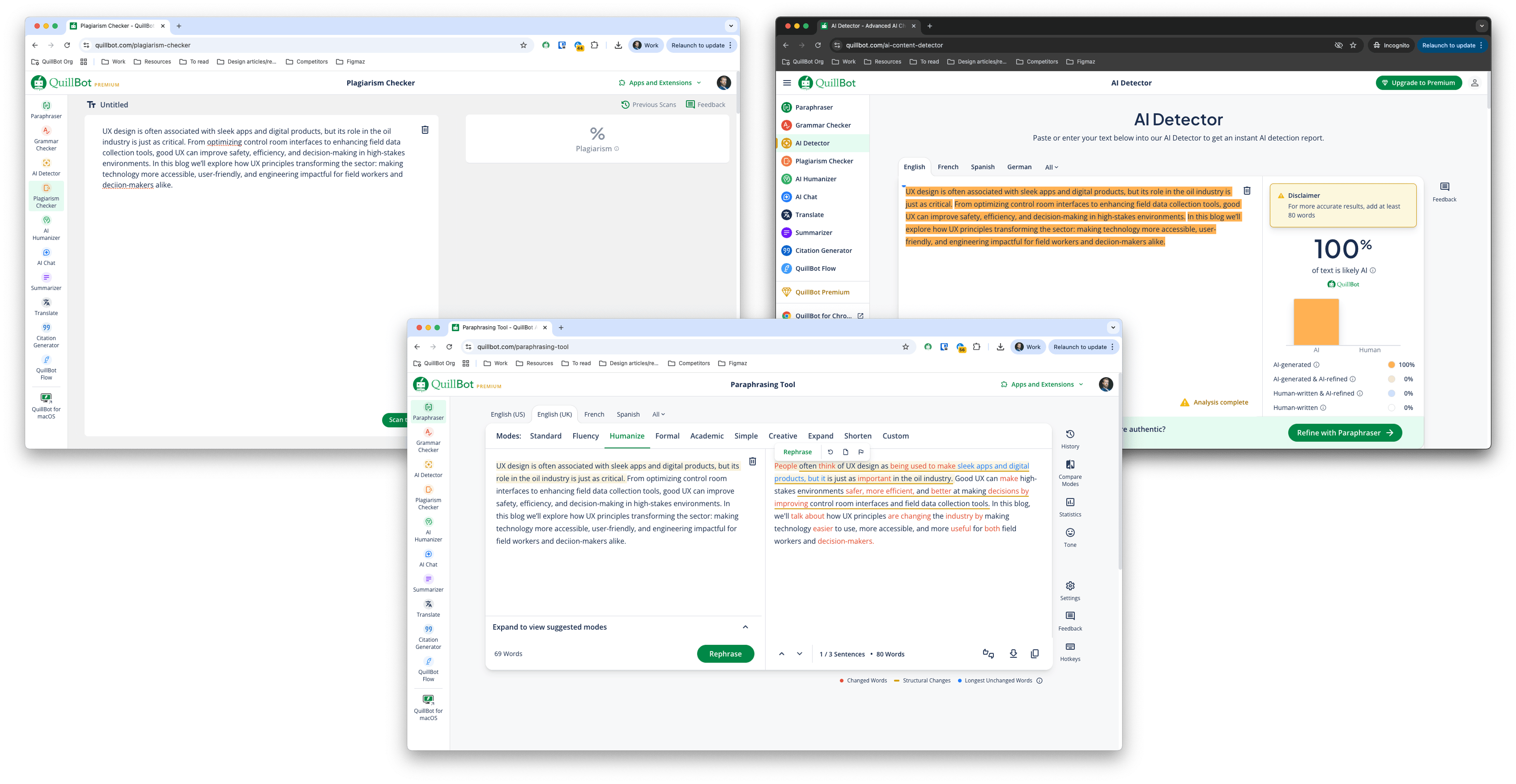
Twelve months ago, the Quillbot web experience was distributed amongst a scattering of transactional tools that, despite sharing a design system, didn’t share a soul.
Each tool had been owned by different teams, built at different times and in different ways, and it showed. The web ecosystem lacked coherence, design quality was staggered (and invariably subpar), and the user experience of navigating between surfaces was cumbersome.
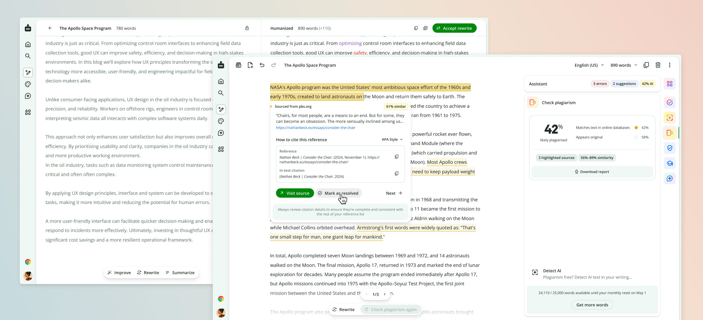
Today, nearly 60% of traffic to Quillbot comes through the writing studio—a fully integrated writing and text refinement product that supports writers from early brainstorming and drafting through to final polish and authenticity analysis.
The writing studio sets a new standard for users visiting Quillbot. Not only does it provide a comprehensively superior user experience, but it performs better on just about all business success metrics, and the story behind its creation begins in the summer of 2025.
From tools to modular capabilities…
Recognising the disunity across the system, I developed a proposal to introduce a “modular product ecosystem” that imposed an architectural structure (conceptual boundaries, layout, UI treatments, responsive guidelines, etc.) within which we could abstract standalone tools into their essential capabilities and resurface them as portable modules.
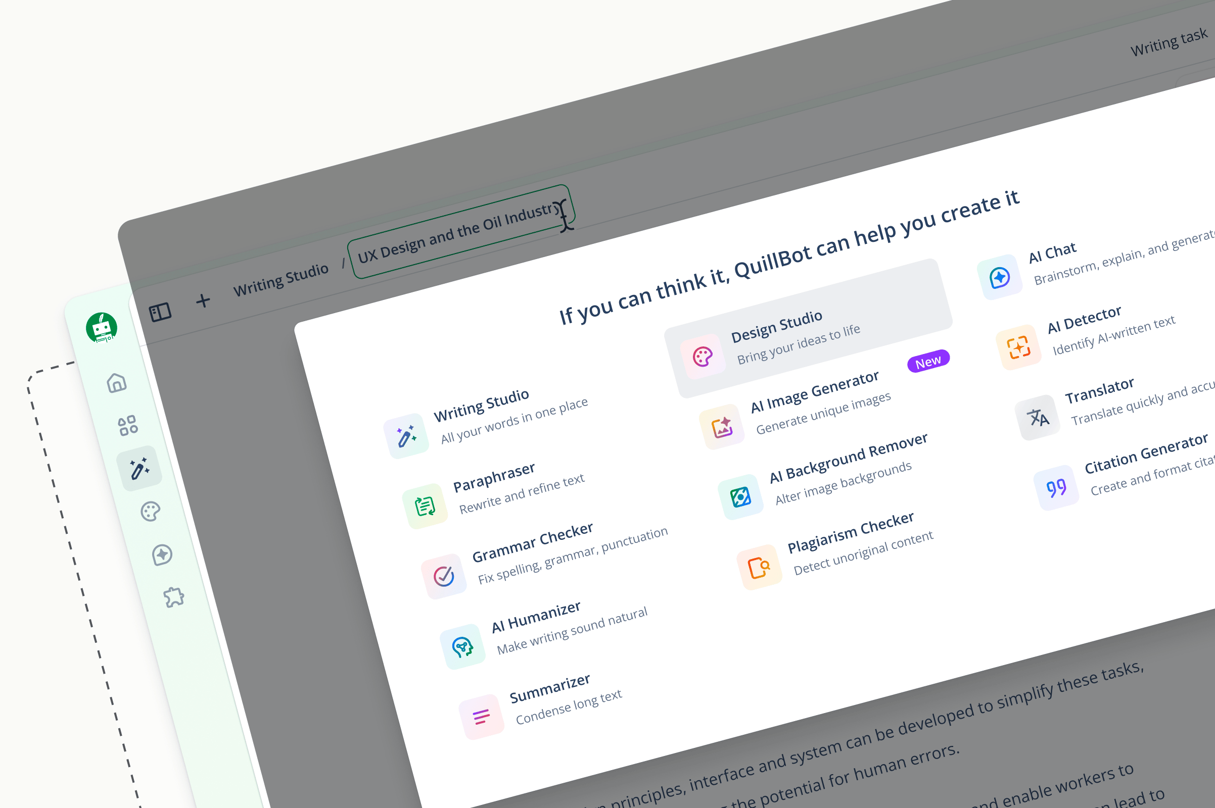
This would enable us to promote the most successful design patterns and bring visual alignment across surfaces so that when users navigated between tools, it made sense that they were still within the same system.
The next logical step was to identify where shared workflows and interaction models overlapped, then begin consolidating them into a single writing surface—this is how the writing studio was established.
Smuggling in the strategy
To pull this off, I’d need to convince a lot of stakeholders who were used to operating in a rapid but siloed manner. Teams felt a strong sense of ownership over their areas and were not always incentivised to think at a platform level. And all of this seemed like an awful lot of work for few immediately discernible gains: how would aligning the system design language and consolidating tools that performed independently improve product KPIs?
In September 2025, at a company offsite in Jaipur, I presented my aspirational product vision as a design initiative that would introduce a “modular design framework”.
To get cross-functional buy-in, I demonstrated how this new thinking would improve long-term engagement and brand positioning, reduce bugs and time wasted building and maintaining similar variants of the same elements, and actually speed up feature deployment and product-led growth through the rapid application of successful experiment learnings.
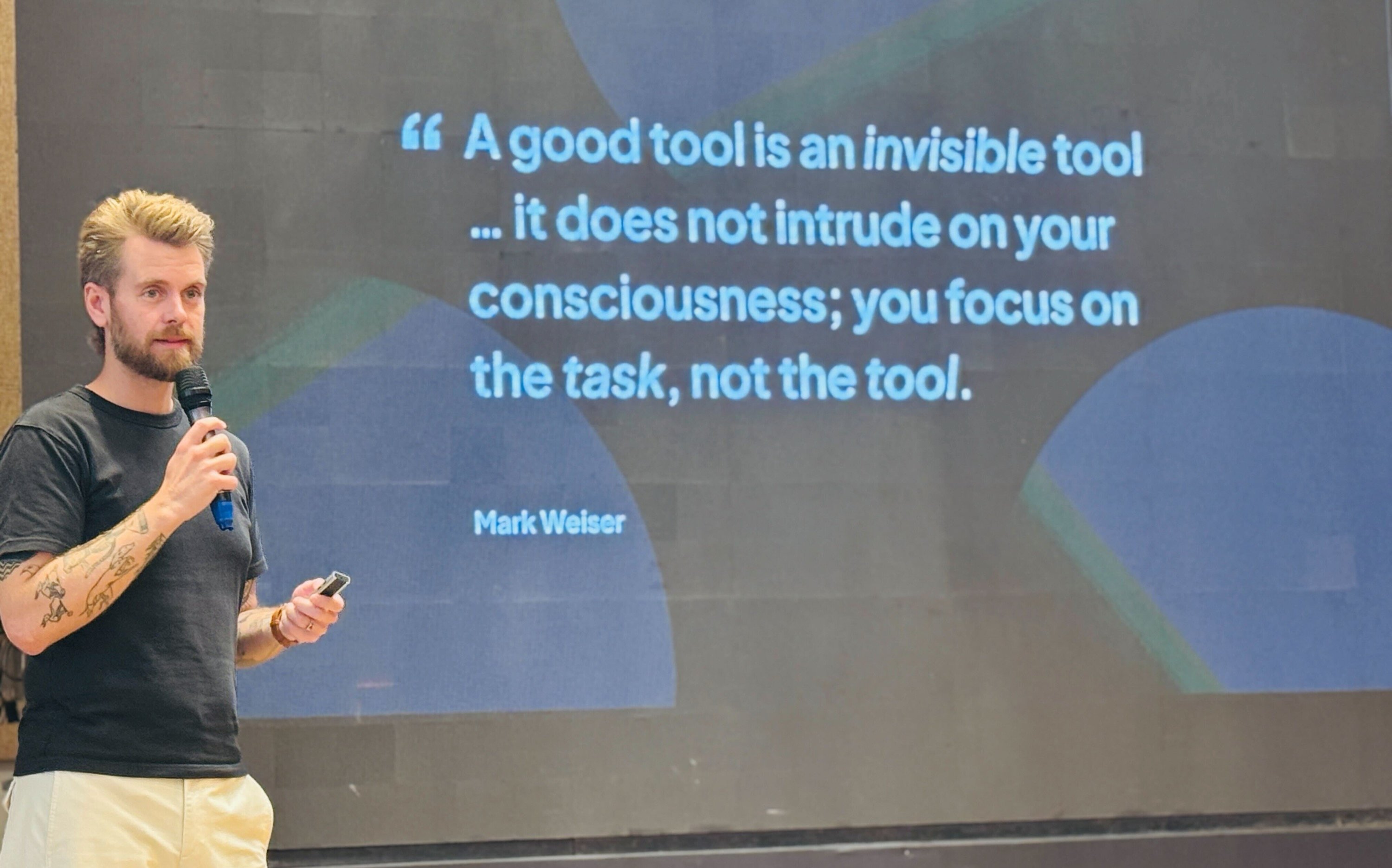
On the surface, I was presenting how we planned to usher in a new era of product design at Quillbot, but I used the opportunity to smuggle in a vision for how Quillbot could become a one-stop AI writing solution with only a single writing canvas around which all our existing and new capabilities adapt based on context.
Appropriately inspired, teams spent the next few days workshopping how to execute on the plan to consolidate and integrate tools. And by the end of the offsite we had a six-month roadmap to v1 in place.
You gotta’ abstract to consolidate
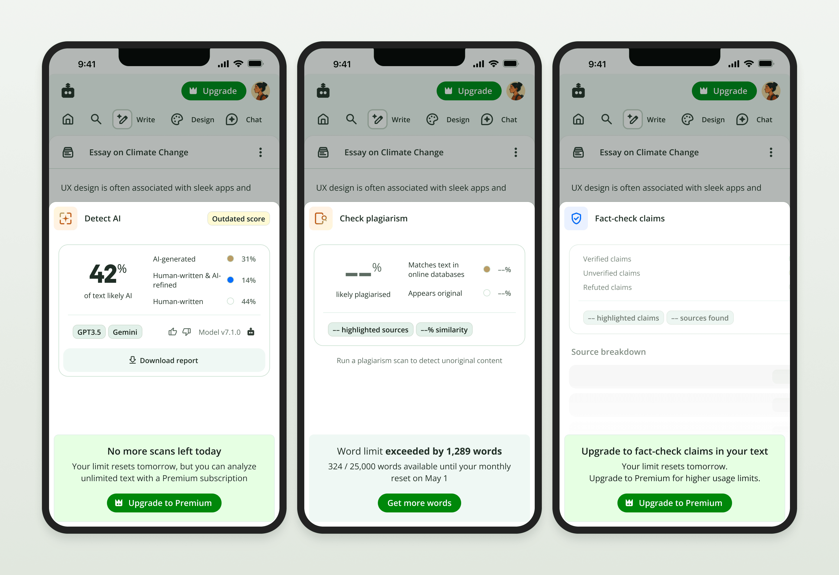
An instinct when consolidating software interfaces is to merge and cluster elements where they appear to make sense. But the only way to build sustainable systems is to strip every existing element down to what it actually represents.
Tool by tool I extracted every interaction pattern and part of the UI from its visual skin and interrogated it. What were the decisions that led to these elements? How are they currently used? Is there a better pattern? What similar inputs and outputs already exist? Why is it framed this way? Is it needed at all?
This occurred over months of collaboration with various product teams around the org, working with designers, PMs, content writers, UX researchers, and engineers to understand why such inconsistencies abounded, and where we could land on patterns that would unite sibling concepts.
I edited until only the essential remained, progressively disclosed elements that anticipated intent, gave users more control to shape their own experiences, and ensured that the system always surfaced predictable next steps.
I edited until only the essential remained, progressively disclosed elements that anticipated intent, gave users more control to shape their own experiences, and ensured that the system always surfaced predictable next steps.
Rewriting assumptions
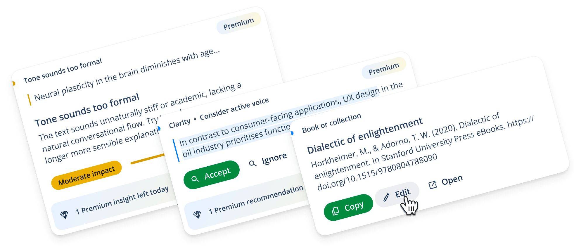
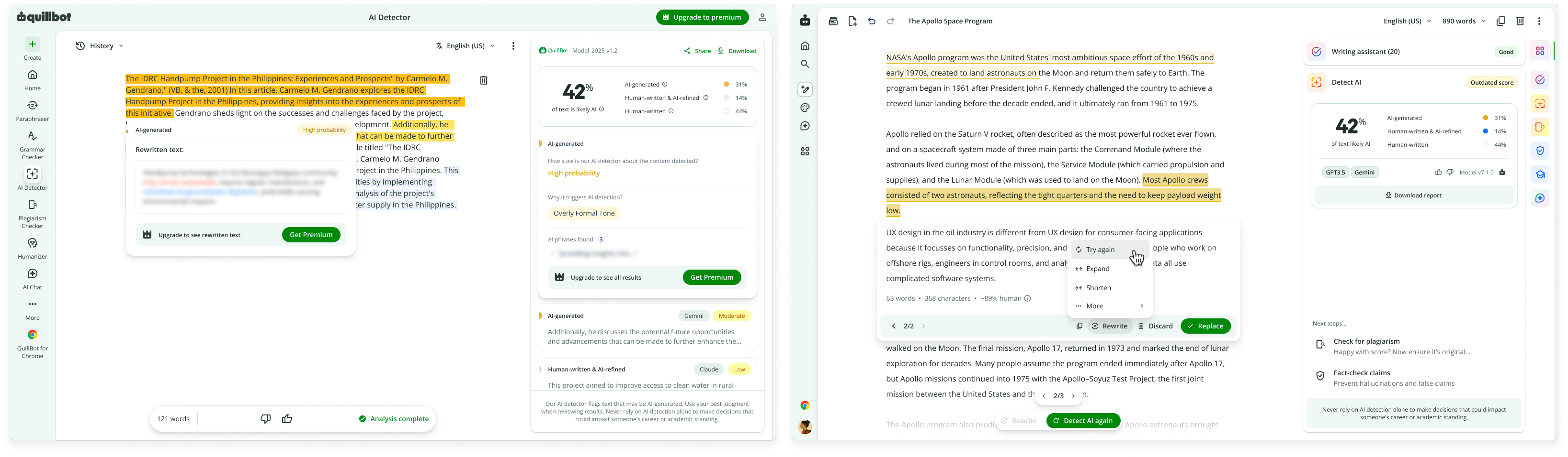
As I combined targeted system feedback across modes into a flexible insight card component, I felt the strain of trying to contain the list of cards within the sidebar module panel. Listing insights below AI text or plagiarism reports detached them from the text in the canvas they referred to.
We opted to move all insights inline, referenced by text highlights rather than in a ‘to do’ list. This faced immediate pushback from the owners of these capabilities. At first many modules were left with evident gaps: empty space where user value could be presented.
I was able to ease concerns by introducing cross-pollination and upsell patterns and sharing out concepts for how the unlocked real estate could be used for deeper analysis and reporting.
As new modules with updated designs gradually rolled out, A/B tests and cohort analysis began to prove our approach to be the right one.
Although not in all cases…
A classic case of ‘unknown knowns’
A big part of design involves finding ways to improve conviction by building knowledge about what works well (through research, testing, borrowing from the best, and experience).
But so much of this knowledge remains in the heads of individuals (and increasingly AIs).
As we began migrating traffic away from the old tools to the writing studio, it exposed how much of their engagement and conversion behaviour was never documented anywhere. Little patterns in the paraphraser, grammar checker, plagiarism checker, and AI detector that worked rather nicely—nobody had written them down, because nobody had needed to until we tried to rebuild them inside a different surface.
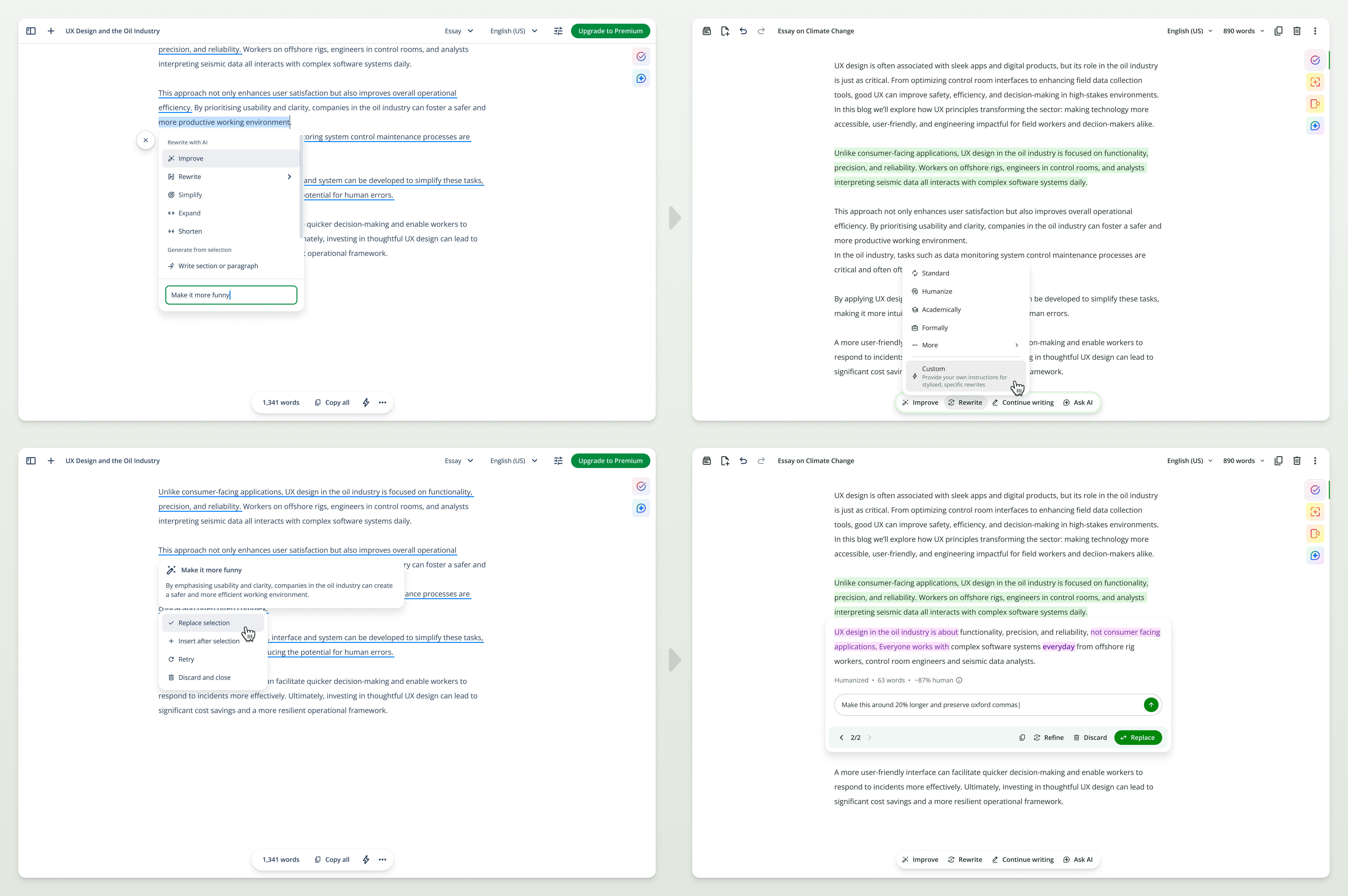
We had some panic moments watching aspects of the writing studio initially underperform the tools it was meant to replace, before scrambling to retroactively add back messaging, retune limits, and patch gaps we hadn't known existed.
But we got there, and with each week we could see the compounding effect of all these improvements in our product analytics.
Beyond modules
The writing studio was never intended to be just the sum of its parts. My intention was for it to become effectively synonymous with Quillbot—at least when it comes to writing. To achieve that, it has to become indispensable: a workflow tool that users can’t live without.
As we rolled out initial modules, I ran a user research study with some of our most engaged customers to understand how their writing and publishing needs were evolving in an AI-saturated world. I found it unsurprising (being an enthusiastic writer myself) that people didn’t want AI to write or think for them, and this informed my developing vision for targeted paraphrasing, “Socratic” and” “dialectical” agents, and split-view text comparison.
Ever since the conception of the writing studio, my guiding principle has been to work towards creating an interactive experience wherein writing feels like painting—not merely a chatbot embedded in a traditional text editor. I stumble daily towards the new paradigms that await.
My guiding principle has been to work towards creating an interactive experience wherein writing feels like painting—not merely a chatbot embedded in a traditional text editor. I stumble daily towards the new paradigms that await.
Modes are a stepping stone
Another key learning was that people (beyond our initial target audience of students) want reassurance about the authenticity and quality of their writing before they publish or submit.
Quillbot works, for a lot of people, as a safe place to get a non-human second opinion before showing their writing to others. Our data back it up. For example, around 80% of writing studio users who check for plagiarism go straight on to AI detection. That insight provoked my next major initiative: the introduction of Agent Skills. But more and more modes are not a sustainable solution.
Eventually I believe we can reach a place where dozens of specialised AI agents act as proactive collaborators on user documents. Such agentic editors will provide writing assistance by arguing different angles and synthesising their suggestions, built to keep the user thinking rather than blindly accepting rewrites and fixes.
More than the sum of its parts
The writing studio now carries ~60% of Quillbot's traffic. Every improvement to every touchpoint now compounds in a way that was previously impossible.
- Folding in the AI detector lifted premium conversion by 15% and scan completions from 74% to 87%.
- Sunsetting the standalone plagiarism checker into the single canvas drove a 53% increase in extra-word purchases, a 25% lift in premium conversion, and roughly double the engagement with citations and source links.
- Cross-pollination between modules runs 15–20% ahead of what the standalone tools managed alone.
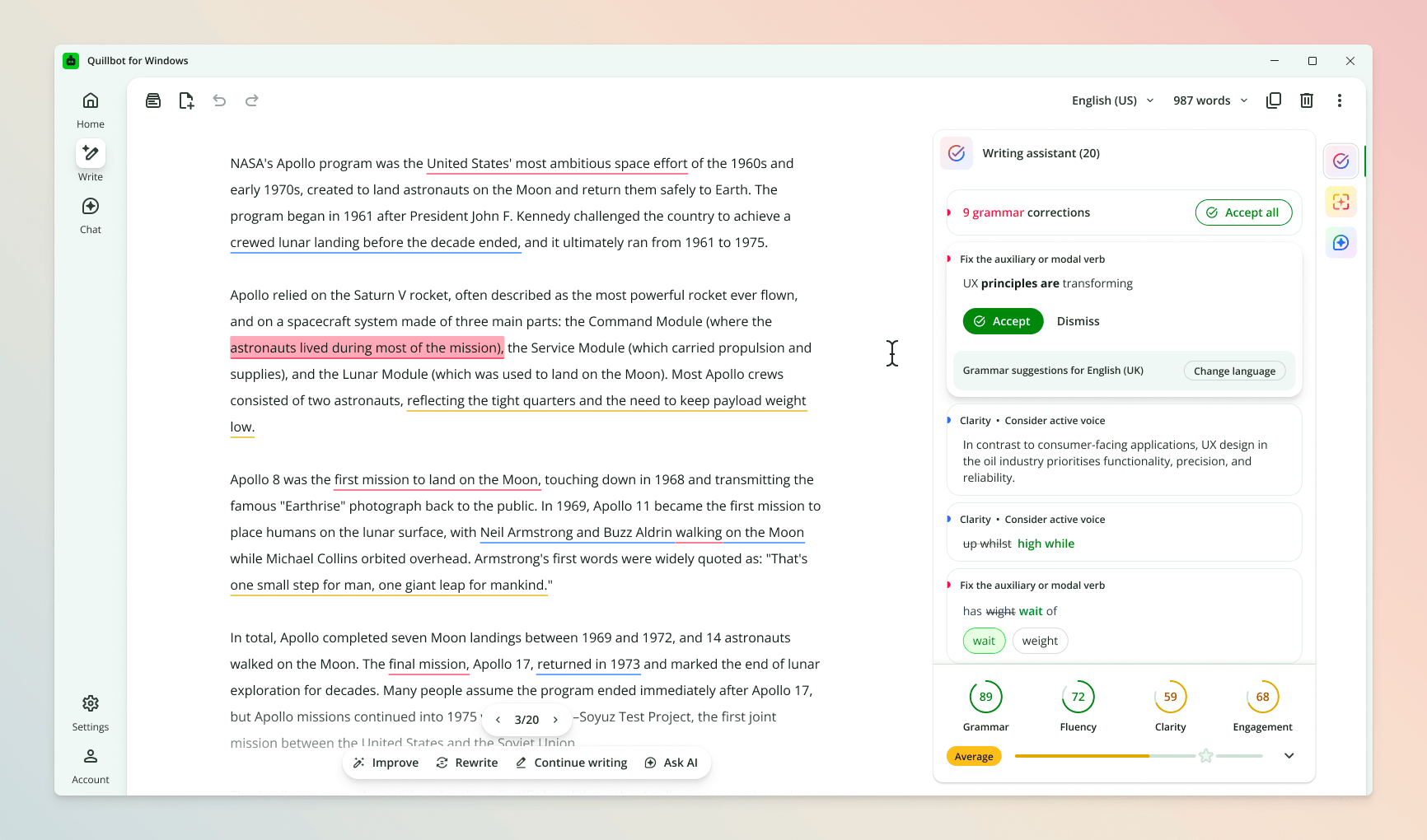
And the modular design framework itself (from earlier on, remember?) outgrew this project entirely—other designers have since rebuilt Quillbot’s design studio, PDF tools, and paraphraser around it, and it formed the architectural base of a new native desktop app shipped by the Apps & Extensions team.
Coda: The human formula
None of this happened solo. I worked directly with two PMs and five engineers on one of the most autonomous teams I've been part of.
Most mornings kick off with an hour-long standup (yes, that’s right!). We show and tell, whip up new ideas, and solve problems together as they arise. Engineers are in the shaping process from day one, and I've worked out of the same Figma file for this project for nearly a year (external stakeholders know where to find me).
We all owned it. And you can't separate the writing studio's success from how this amazing (I’m biased, I know) group of people worked together.